When a house has impressive views, it’s a balancing act to design interiors that complement instead of compete with the location. While having a home with lovely views is one of life’s great pleasures, it’s the interiors that set the standard for daily life. The ideal balance is interiors that live well without stealing the show, and nobody does it better than Margaret Donaldson Interiors.
“When we say a home should ‘live well,’ we mean it has to be beautiful, comfortable and welcoming, but it also has to be practical in all of the ways that make life easier,” Donaldson says. For more than 30 years, she and her team have been creating interiors that are kid-, guest- and pet-friendly, and cozy enough for two but comfortable when there’s a crowd. During more than three decades of work in the Lowcountry, the firm has perfected every system required for good communication, timing and budget management.

They also want their clients to have fun, which is apparent from the first meeting in their welcoming (and dog-friendly) design studio. “Organization is second nature to us,” Donaldson says. “We like being creative, but we like the business of design almost as much. Our job is to manage the details so our clients can enjoy the process.”
The home we’re seeing today is a 5,300-square-foot new construction dwelling on Daniel Island, built by Tre Sheppard of Sheppard Construction with interior design by Margaret Donaldson Interiors (MDI). Created for a couple with grown children and grandchildren who visit frequently, the four-bedroom, seven-bath house has dreamy waterfront views and a few interior design surprises.

Lead designer Lily Cannon was tasked with creating interiors that would be casual, comfortable and inviting while reflecting the homeowner’s interests and extensive travels. “We ask a lot of questions up front so we can understand our clients’ lifestyles,” Cannon says. “It’s OK if they don’t know exactly what they want; we’ll figure it out and create it. On this project, the clients had special treasures they wanted to incorporate and a few pieces of furniture from their existing home. Otherwise, they were really open to ideas and weren’t afraid to be bold.”
For Cannon, the trick to balancing interiors with dramatic views was to use an organic color palette with layered textures to add depth and dimension. She also incorporated interest by enhancing architectural details, adding eclectic touches and a few moments of design drama.

As we enter the foyer, we see through the open living room and kitchen to the back of the house and on to lush marsh and water views. Here, we get a hint of the mastery of materials that give the home its personality. The airy, double-height entry has a 20-foot ceiling, which could distract the eye from the forward flow. Cannon’s answer was to install a massive steel light fixture that brings the eye down and balances the dark-tiled stairway wall to the left. “Without the light fixture, your eyes would just shoot up to the ceiling,” Cannon says. “The space was just asking for something huge to balance it, and a fixture in any other finish wouldn’t have had the same effect.”
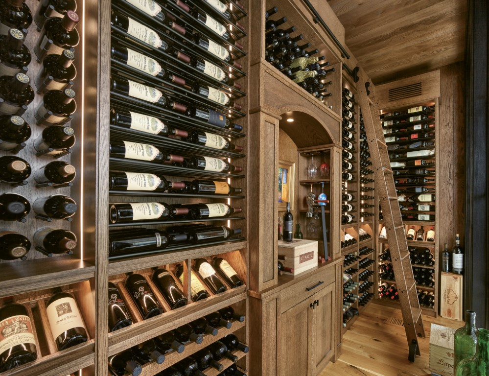
The formal dining room is to the right of the entry, which is where we immediately experience one of the home’s design surprises. Cannon painted the walls a high-gloss burnt orange and applied a cork wallpaper with foil flecks to the ceiling. “When we pitched the idea of burnt orange to the client, it was a stretch for her to imagine it, but she trusted us,” she says. “There are so many windows, and then the glass walls of the wine room. We knew this was the room where we should go bold.”

Cannon used the client’s table and added chairs custom upholstered in a white performance fabric. Notice how the leather cording trim outlines each chair so they don’t disappear into the rug or draperies? That’s the level of design detail for which MDI is known. To finish the room, a circular statement light fixture confirms this is the place for fancy dinners.
The living room and kitchen are the heart of this home, so the MDI team ensured everything was functional and comfortable for the way the couple and their guests live. In the kitchen, cabinets are painted with Benjamin Moore “Smoke and Mirrors,” an oyster shell gray that’s the perfect contrast for the warm wood beams and accents.

The island has a white quartzite top with waterfall edges that wrap over light natural hickory cabinetry. Cannon opted for oversize pulls on the doors and knobs in an antique nickel finish, complementing the light fixture over the island. The backsplash is made of the same quartzite slabs on the countertop, which adds more organic elegance to the space. Overhead, two copper pendant lights with a verdigris patina pick up the blue-green tones of the artwork in the living room and the light blue of the chairs.
To the left of the island, a table with a custom banquet and chairs creates a casual place for meals. Cannon had the front of the chairs upholstered in performance fabric but for the backs used a contrasting embroidered fabric. Behind the kitchen is a sleek butler’s pantry with a sink, freezer, dishwasher, ice maker and storage.
Cannon wanted to maximize seating for the large family in the living room, so she commissioned an oversize square cocktail table that houses four custom ottomans that can roll out when needed. Because the back wall of glass doors is usually open, she chose two custom upholstered swivel chairs that can shift from being part of the living room grouping to a quiet place to take in the view.

To highlight the beams and the large-format tiles on the fireplace, two vivid artworks hang against a tone-on-tone wallpaper backdrop in the place of shelving. Lower cabinets provide plenty of storage for cozy blankets and games. A large sectional sofa wraps around the cocktail table and is flanked by two open side tables with textured ceramic lamps. Muted orange and blue throw pillows add warmth to the neutral palette.
The powder room that serves the downstairs has textured wallpaper in shades of ocean blue with a lighter blue trim to complement it. The custom vanity, a client request, has a chunky wood base with four steel legs with an aged patina.
The downstairs primary bedroom is a serene haven with floor-to-ceiling black steel doors and windows overlooking the marsh. The bedroom has a large closet with ample storage, so Cannon chose a streamlined wood console instead of a dresser. Three-drawer nightstands in a warm wood tone have a fluted detail that echoes the cabinet glass in the bathroom. The bed has an upholstered headboard with vertical tufts and fabric with a subtle sheen. The husk wallpaper is made from banana bark and has a significant texture that adds to the room’s interest. Another of the small details that make a big difference are the drapery rods, which were custom painted so they disappear.
In the primary bathroom, the stone backsplash runs just high enough to capture the faucets mounted on the wall. Rectangular metal and glass sconces are elegantly mounted over the framed mirrors. The middle storage cabinet has glass doors to lighten the visual weight, but the glass is fluted, so the client doesn’t have to keep her products in perfect order.
Also downstairs is the laundry room, which turned out to be a favorite room. With lovely small details, such as dark tile in a herringbone pattern with a light contrasting grout, geometric wallpaper with a washed-out finish and bronze pendant lights, this is a cheery spot to fluff and fold.
Back in the entry, as we go up the stairs, the brilliant materiality of the home comes into focus. From here, we can see the various metals and wood tones that form a backdrop for the organic color palette. “People are afraid to mix metals and wood tones, but they shouldn’t be,” Cannon says. “You’re allowed to mix finishes; it’s a subtle way to add interest.” Not only do the various tones and finishes add interest, but they make this new home feel cozy and collected.

As we head up the stairs, we’re up close with the beautiful tower of 24-by-48-inch charcoal gray tiles that wrap the elevator shaft and form the core of the stairwell. The effect is a reassuring monolith that provides a visual anchor for the glass and wood staircase and the natural light that pours in the front and back windows.
Upstairs are two guest rooms, an office, a bunk room and a TV room, which serves as a living room and playroom for the bunk room. In the TV room, custom cabinets with drawers and shelves provide storage while double doors in a herringbone pattern conceal a Murphy bed that can be pulled out for extra sleeping space. A warm brown sectional wraps around a leather ottoman, repurposed from the client’s former home. The grouping is tied together with throw pillows in sky blue and flamingo pink shades, which are playful foils to the lemon yellow ottoman.
The bunk room features a mix of twin, full and queen beds, with storage drawers beneath the platforms of the lower bunks. The stairs leading to the top bunks have drawers where top-bunk dwellers can stash their stuff. The bunk structures, bed platforms and stairs are painted a nautical blue with pewter cupped handles. On the walls, the client chose a textured wallpaper in tawny brown.
In the guest room that shares a Jack-and-Jill bath with the bunk room, Cannon repurposed a bed from the client’s former home and added a new rug, round wood nightstands and custom window treatments in yellow and blue to pick up the vibrant yellow of the bedside lamps. The shared bathroom features rich dark wood cabinetry with brass and frosted glass sconces mounted on the framed mirror.
In the second guest room, a bed is upholstered in creamy white with white three-drawer nightstands on either side. Custom Roman shades and draperies in a lime green and white lattice pattern give this room its own personality.
The final room is one of the couple’s favorites. The game room, designed around their taxidermy collection, has a white ceiling and shiplap walls, a wet bar, a television, and a sunset and sunrise deck. The shiplap gives the room a Lowcountry sense of place while acting as the perfect backdrop for the client’s eclectic collection.
“They were the absolute perfect clients,” Cannon says. “They were in tune with the architectural details and excited about the possibilities for cool design elements. They definitely enjoyed the process, which made it fun.” *
Robin Howard is a freelance writer in Charleston. See more of her work at robinhowardwrites.com.

